Back to - PORTFOLIO

Interface Design
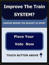
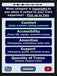
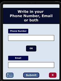
For this project, I had to design a touchscreen interface, made to be at a train station to find out how train users think the railway budget should be spent. The location, size, layout, and user flow are specific UX elements that were considered when making the design. The government conducted design research to come up with a list of questions and options for how the railway budget could be spent.
Rationale
The design I have created has been well thought out, with every decision being made so that it meets all the requirements of the brief. To accomplish this, I made sure that the design was able to incorporate the questions and all the preferences that needed to
be provided, but in a way that was easy for users to understand and interact with.
Skills From This Project
Figma
This project is where I learnt Figma
User Testing
Being able to write a script and do user testing.
Wireframing
Made wireframes to display all the screens to easily demonstrate my ideas.
User Flow
A diagram to visually display the users interactions with the interface.
Accessibility
Learnt about different disabilities, and how designs can unintentionally exclude them. Also, learnt about WCAG (Web Content Accessibility Guidelines)
Process
1. Wireframes
Made wireframes for each screen (11 screens). I had to consider the size of the buttons and the text. Also, had to figure out how the content would be laid out. This involved having to edit questions to make them easier for users to understand.


2. Drawings
Drew pictures of how users would interact with the interface. I had to consider how to make it accessible to all different types of users. I explained the decisions made through annotations in my documentation.


3. User Flow
Made a user flow to clearly lay out the user's process when interacting with the interface.
4. Made the Prototype
Created the prototype on Figma.
5. User Testing
Wrote out a script, which has an introduction, warm-up questions, tasks and follow up questions. This script was used to understand users thoughts when testing. Got feedback which was then implemented into the final prototype.
6. Final ProtoType
Finished making the prototype.


